Lina
UX Researcher/ Designer, UI Designer
April 2020
Lina is a platform that enables parents and grandparents to share meaningful wisdom and life experiences with their children.
Our team was tasked with creating a website version of their existing app, focusing on user onboarding, site navigation, and content creation, while conducting user research to inform targeted design decisions.
Process involved:
User Research/ Testing, Sketching, Competitive Analysis, Persona/ Problem Statement Creation, Wireframing/ Prototyping, Visual Design

Research
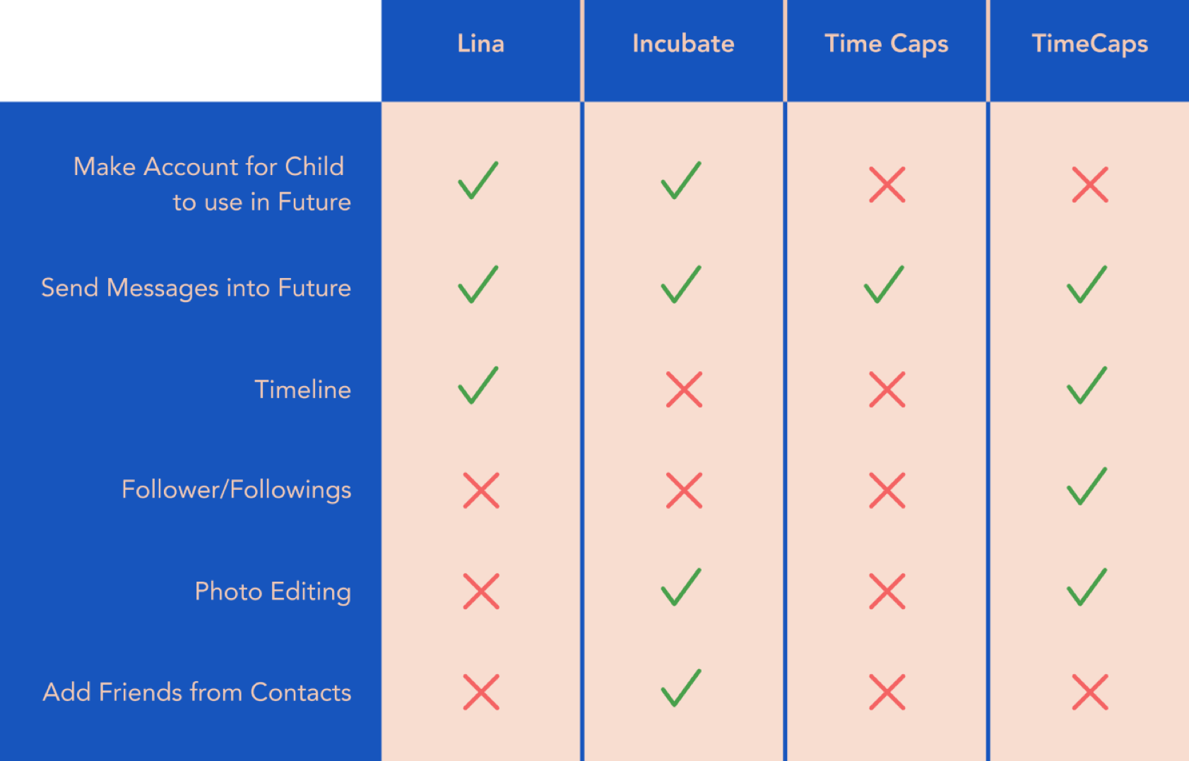
Researching Lina’s competitors was challenging because it was a product unlike anything else on the app store. Its main goals were journaling, time capsule capabilities, and memory sharing - based on these features, our team conducted three C&C analyses to better understand the market.
Next, we sent out a screener survey via social media in order to recruit parents for interviews. Highlighted above are interesting data patterns found from the 25 survey responses we received and key quotes from 10 interviews.
Ideate
Our data showed the target users for Lina would most likely fall into one of two categories: new parents or grandparents. As such, our team ideated two representative personas, Adam Young and Helen McCourt.
Feedback from interviews was synthesized and helped decide which features would be implemented into the MVP of the web platform. To prioritize features, our team utilized the MoSCoW Method which determined order of implementation.
Finally, in order to imagine the navigation of our platform, we created information architecture to distinguish our main from secondary navigation.
Design
Since our team was working remotely during this contract project, we held digital design sessions and sketched/ compared pages via Zoom. We then built a medium fidelity platform which was comprised of various aspects from everyones’ designs.
When our wireframes were prototyped, we tested our designs on four users. With the data compiled from our first round, iterations were implemented and the prototype was tested again on another four users. Finally, after the second round of testing we iterated again and tested a final three users.
Ultimately, we handed off our designs in medium fidelity to the Generation Transfer design team. However, I’ve taken the liberty to build out our designs in high fidelity, depicted below.

Understanding target users
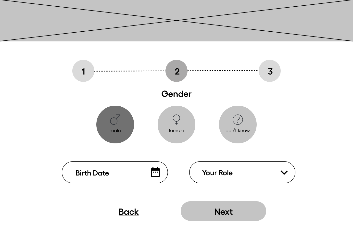
Our team aimed to design with accessibility in mind; knowing Lina’s target market (parents or grandparents) we wanted to create a system that was as simple as possible, for less tech-savvy users. The landing page featured Lina’s key differentiators and included social media login options for faster sign-up/ sign-in. The onboarding process was limited to three easy steps with the goal of getting users onto the site, and creating content, faster.

Redefining the timeline
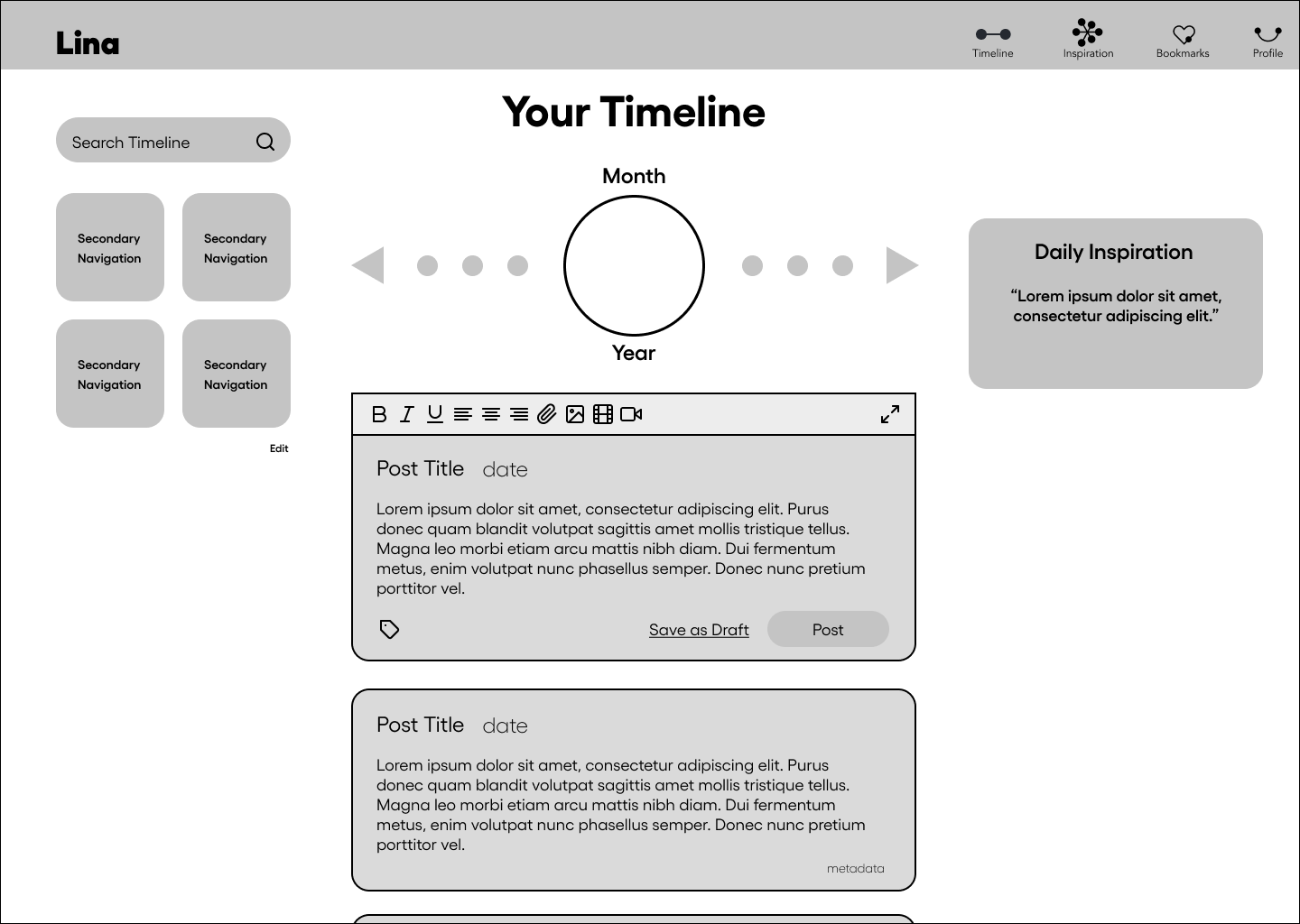
Lina’s timeline page was created with a focus on post creation and navigating through them. While the posting module was standard, the timeline module above it allowed users to scroll through past posts or jump ahead to post on future dates. The customizable module on the left lets users view and organize posts by metadata information, while the right module offers prompts to help users generate content.

Prioritizing ease of site navigation
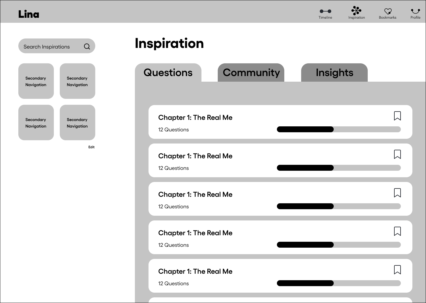
Our main navigation was designed to help guide users through Lina’s four most important pages. The profile page had a storage tracker with an upgrade to pro option, as well as a CTA allowing users to export all their posts/ files. The inspiration page housed various modules (Questions, Community, and Insights), all of which promoted users to create content or share with others. Lastly, the bookmarks page which is where content from the inspiration modules could be saved and revisited.

Reflection
Working with Generation Transfer, our team was able to get real, on-the-job experience working for a legitimate startup company.
Consulting with Client
In consulting with Generation Transfer’s stakeholders, we were able to collectively formulate a direction for the app’s purpose and design. Not only did this offer a great opportunity to enhance our communication skills, it also offered us a chance to teach and explain foundational User Experience ideas and practices.
Working Remote
As working remotely becomes increasingly common in the workplace, this project gave us a taste of the soon-to-be norm. Working remotely (though not by choice), allowed us to hone our sense of accountability and ensured that we created and adhered to a well-organized game plan.
Adjustability
With COVID-19 and the changes it brought with it, we were forced to adjust to the situation at hand. As our General Assembly cohort was intended for an in-class setting, the mandatory quarantines took getting used to for many. However, utilizing digital tools and each other’s resourcefulness, our entire cohort was able to overcome and thrive under these conditions.


